InterGenOS Artwork
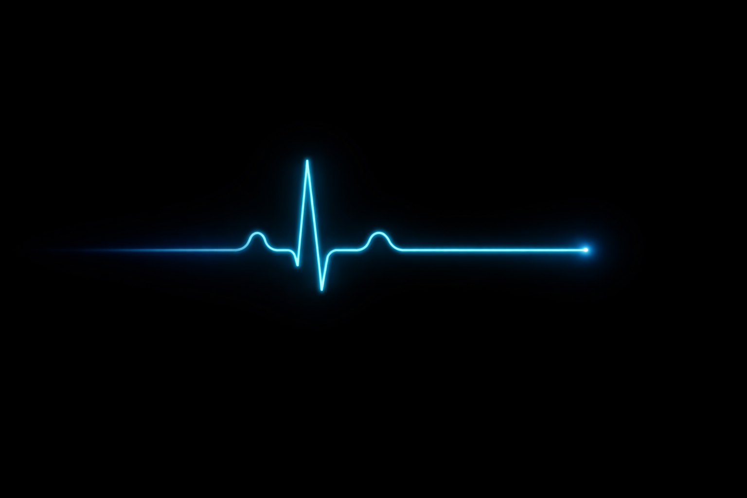
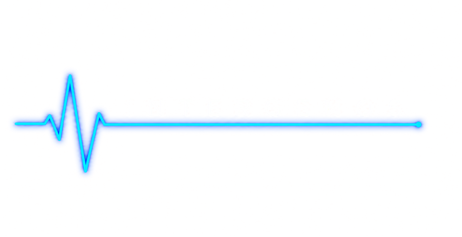
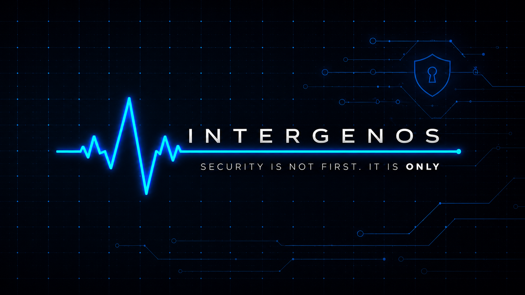
The visual identity of InterGenOS is built around one idea: a single blue pulse
crossing a black field. It is an ECG trace — a heartbeat — rendered in
#0099FF on black, and it recurs everywhere from the app icon to the first-boot
animation. This page collects the project’s marks, wordmarks, and wallpapers in
one place.
Using these: the logo, icon, and wordmark are the InterGenOS project’s identity — please don’t alter them or use them to imply endorsement. The wallpapers are here for InterGenOS users to enjoy on their own machines.
Logo & Icon
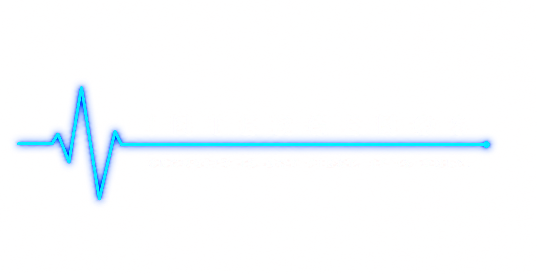
The icon is the pulse on a rounded-square field; the logo stretches the same pulse into a horizontal lockup. Each ships in three variants — solid (black field), transparent, and white (for dark surfaces).
App icon — full
![]()
Variants: transparent · white
App icon — simple
![]()
Variant: transparent
Logo lockup
![]()
Variants: transparent · white
Alternate logo (perspective)
![]()
Wordmark
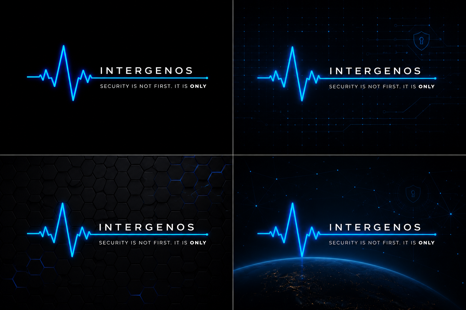
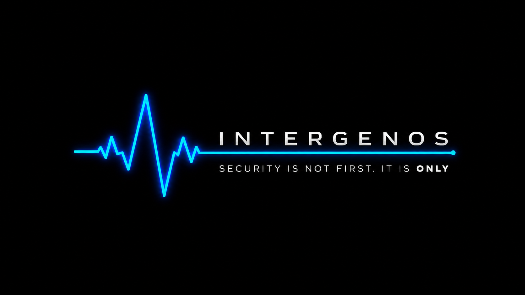
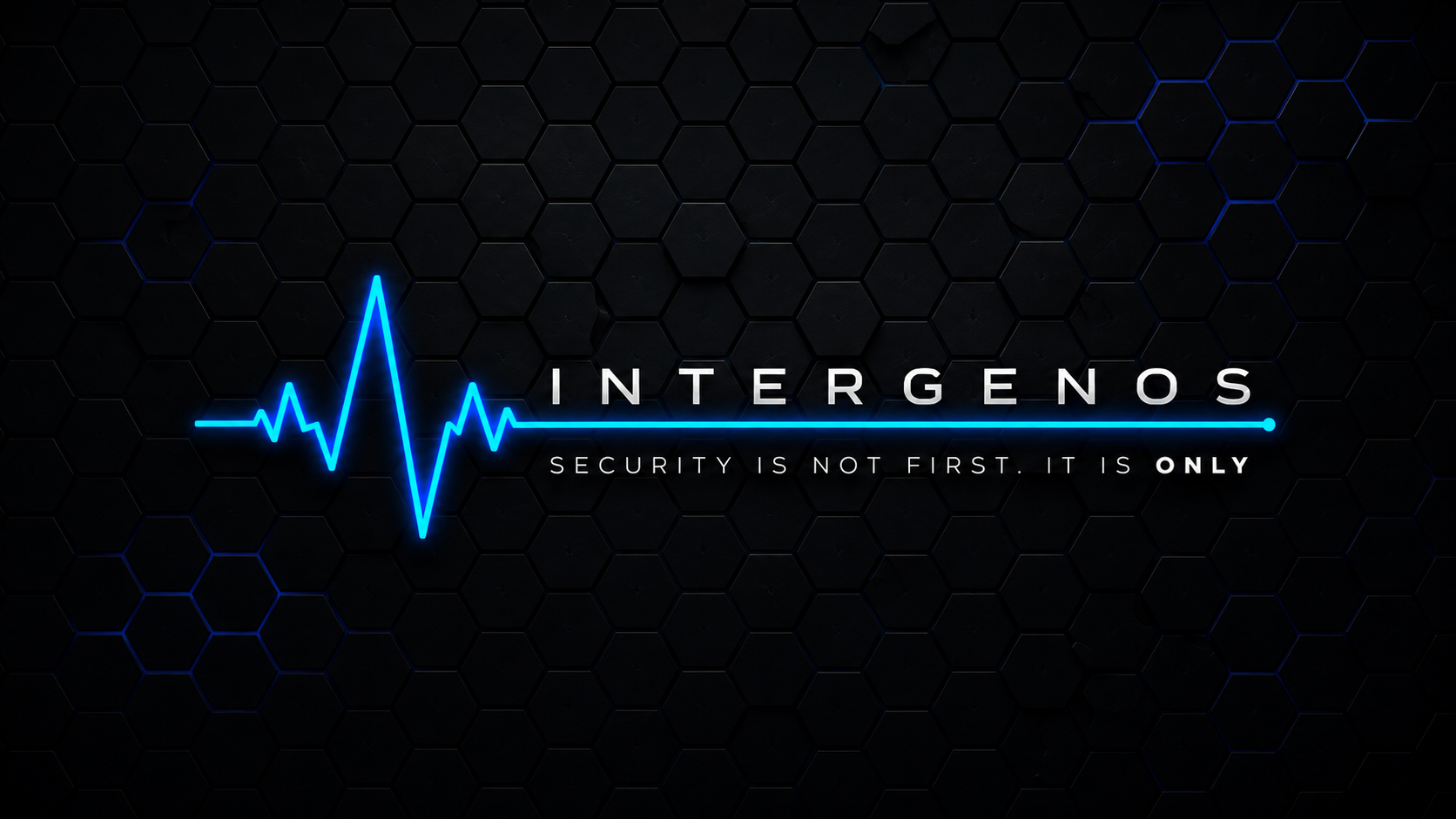
The wordmark sets the project name in the brand type, with and without the tagline.
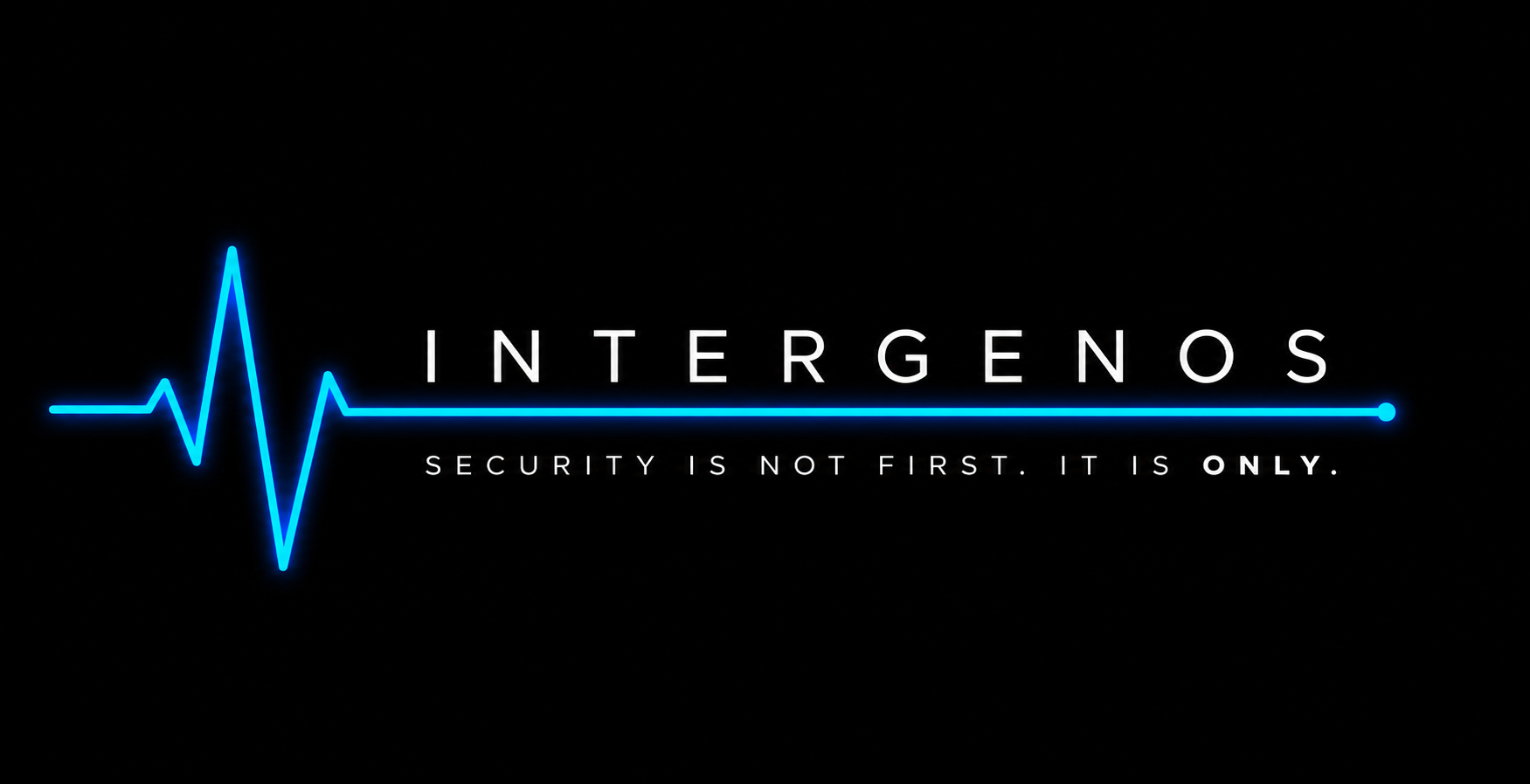
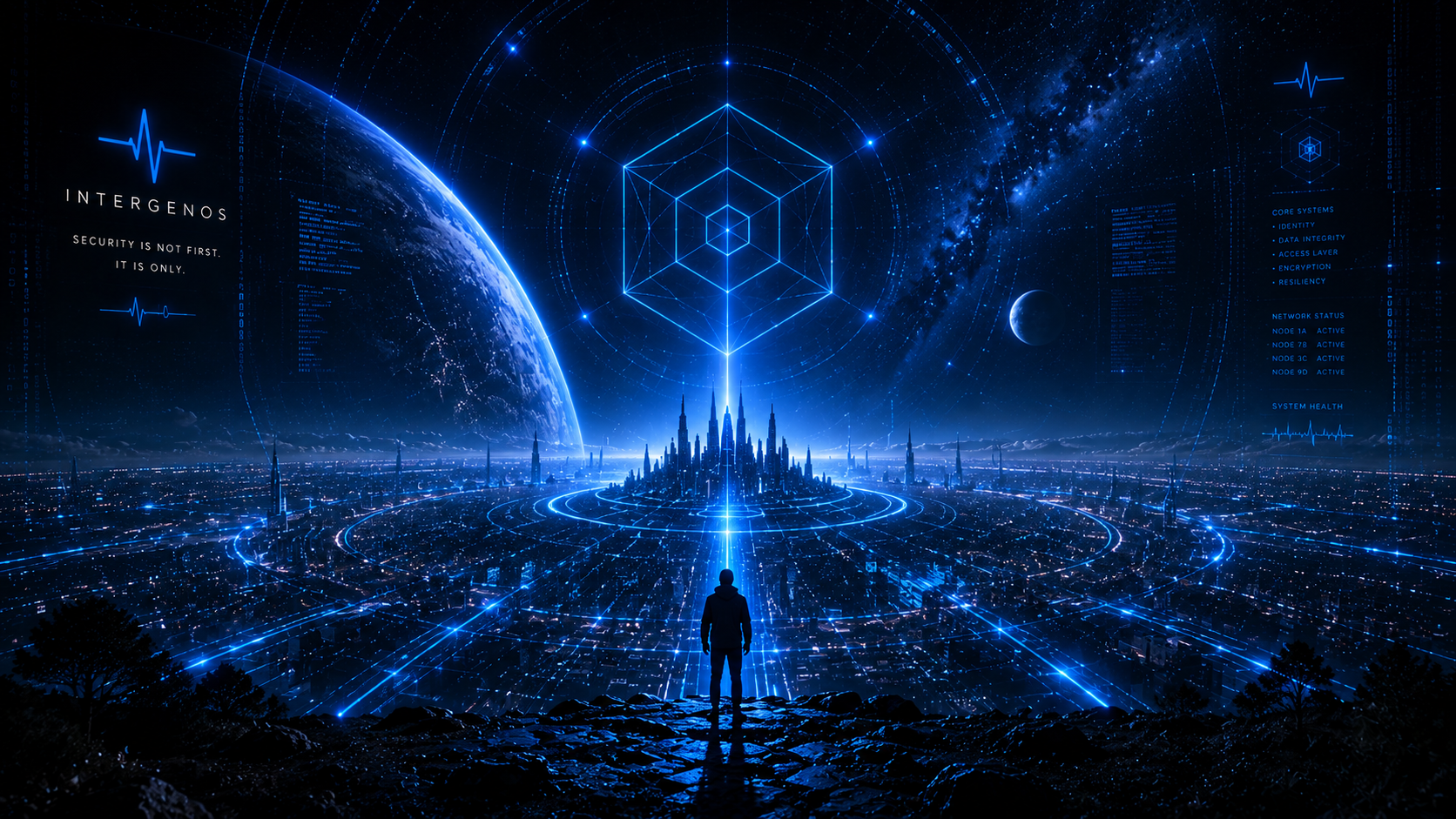
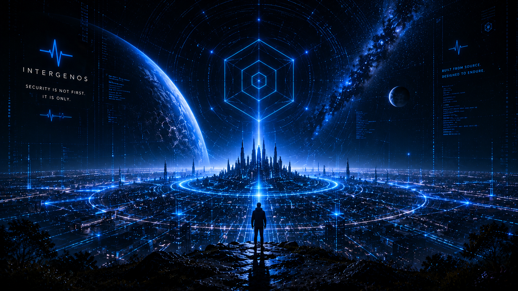
The pulse-and-tagline lockup — the heartbeat crossing into the wordmark over “Security is not first. It is only” — shown across the brand’s surface treatments.
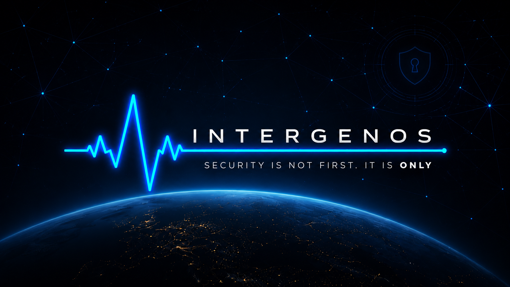
Wallpapers
The default desktop wallpaper plus the logo and pulse treatments and the concept set explored during the visual-identity work.
Default

Logo wallpaper
![]()
Pulse wallpaper

Hero
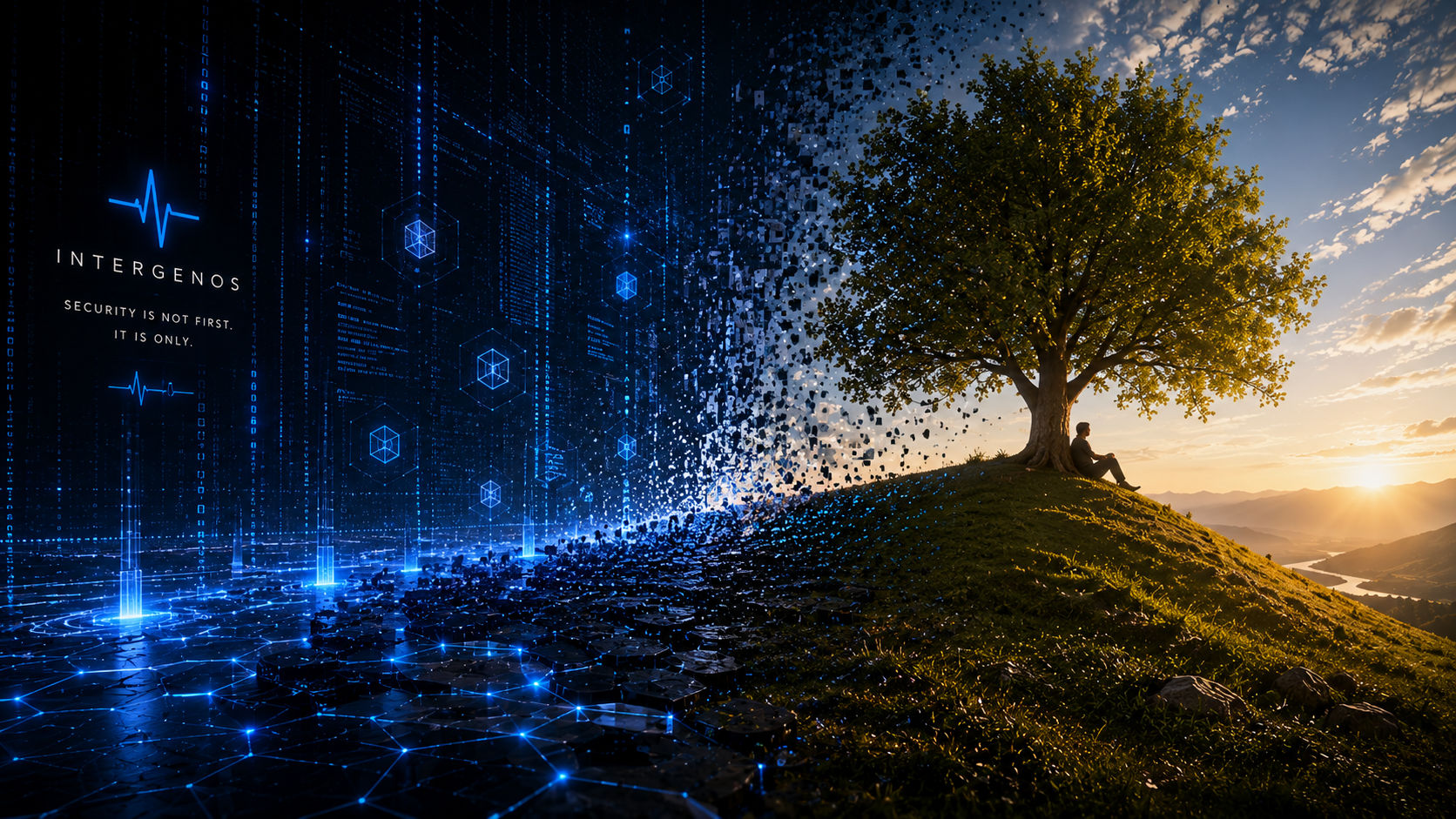
Concepts
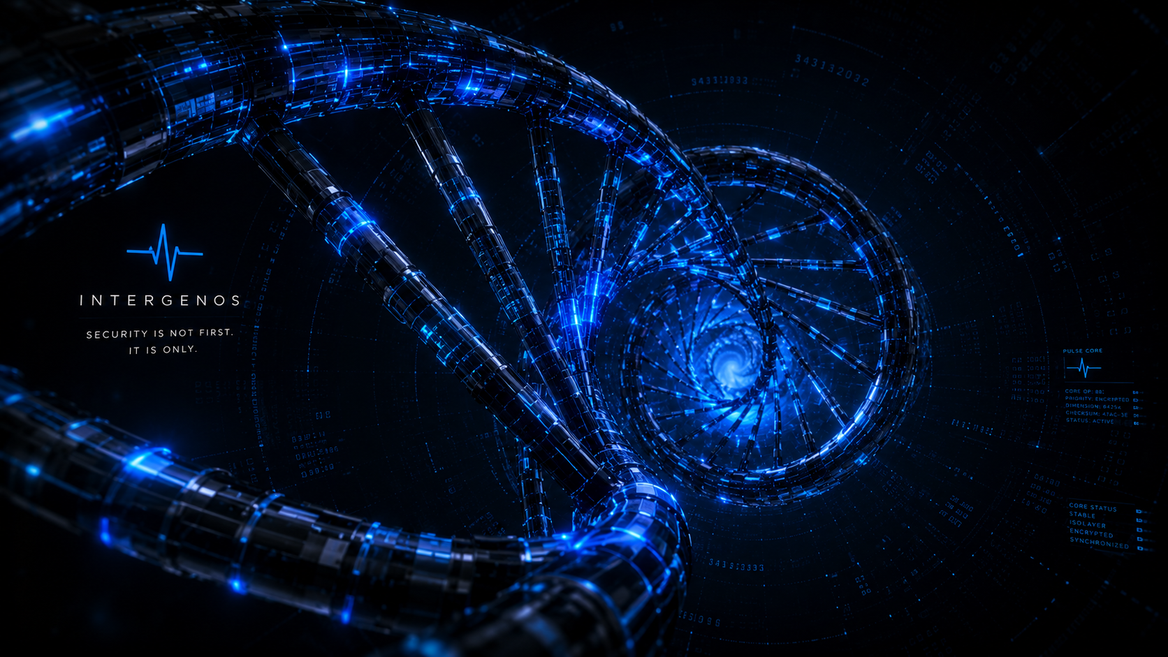

Brand Elements
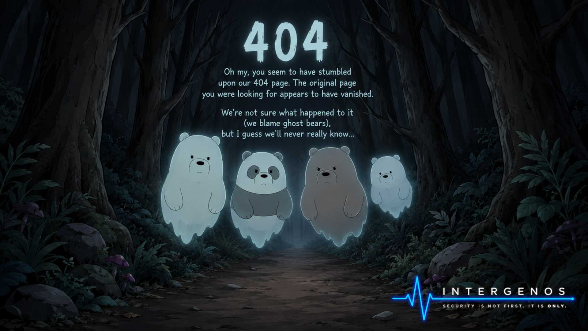
The pulse motif on its own, and the artwork that fronts the site’s 404 page.